Track the weather in your area over a two-week period. Use bar graphs and line graphs to illustrate the results of your study in a colorful way!
1.
Graphs allow us to easily identify and compare data as the result of a study. Two common types of graphs are bar graphs and line graphs. Bar graphs use vertical or horizontal rectangles (bars) to represent a specified quantity. Line graphs use points to identify values, and then connect each point with a line that shows the fluctuations in the data. Look at examples of each type of graph with your class. What information is included on each?
2.
Study the local weather with your class over the next two weeks. On the classroom whiteboard, keep track of the temperature if the weather is sunny, cloudy, rainy or windy each day. Will some days be rainy and windy, or sunny and cloudy? For days like these, choose the one description that depicts the day the most.
3.
At the end of the two-weeks, chart your results! Use Crayola® Dry-Erase Markers or Dry-Erase Crayons to create a colorful bar graph on the whiteboard showing how many days were sunny, cloudy, rainy and windy. Display the temperature results using a line graph!
Catch the wind and see colors spin! Hang your wind spinner beside an open window or under a protected porch roof to catc
How do you measure up to a whale? Draw yourself in proportion to larger and smaller creatures.
Exercise your brain (and have fun) doing Sudokus. Crayola® Dry-Erase Markers make it easy to create and solve your own f
Create cool color tricks while learning about primary and secondary colors and color blending.
Sparkling snowflakes, raindrops, flowers, or crispy leaves let everyone know that the seasons are changing. What season
View the landscape from a new perspective, using your imagination to creatively paint objects as they would appear from
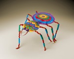
Tarantulas are huge, hairy, and terrifying! Learn more about this colorful, mysterious arthropod before you design your
Build your own kaleidoscope to experiment with visual perception.