Get more out of your favorite color! Create 9 shades of your favorite hue in this value scale exercise.
1.
Have you ever looked at a black and white photograph before? Observe a few black and white images with your class. Are the images only black and white? Are there shades of gray present as well? In the absence of color, we rely on values to define the detail of the image. Value is the element of art that describes the amount of lightness or darkness in a hue. In a black and white photo, white is the lightest value, and black is the darkest value. There are shades of gray in between that range from white to black. Observe a value scale to see white gradually change to black! Can you find an example of each shade in the photographs?
2.
Values help to add depth to a drawing or painting so it looks more 3D. Imagine any of the black and white pictures as outlines without the values. Does it still look like a photograph, or is it flat and cartoon-like? This is why being able to create values is such a powerful skill to have as an artist.
3.
Colors have values too! Some colors, like blue, are darker in value when compared with a fairly light color, like yellow. Think of your favorite color. Where on the value scale would it fall? Is it closer to white, black, or right in the middle?
4.
Select your favorite color Crayola® Colored Pencil and create a value scale that ranges from white to black with that hue! Start by neatly drawing 9 squares side-by-side on a sheet of white paper. Use a ruler to get crisp, straight lines. Leave the square all the way to the left blank. This will be your lightest value, white. Fill in the far right square with black Colored Pencil. Press firmly on the Colored Pencil to completely cover all of the white paper in that square.
5.
Lightly build up layers of color in each square until you have a full value scale! Add white or black colored pencil as needed to smoothly transition a full range of values along each square in your scale. Tip: If you squint your eyes when looking at the
Travel ancient trade routes! What products were exchanged? Where were the major ports? How did traders cross land? Show
What do you get when you combine Crayola® Dry-Erase Crayons and a plastic box frame? Hours of simple fun and learning!
Create an intricate stained glass pattern. On tracing paper, translucent marker colors seem to glow in sunlight.
Celebrate the Ch'ing Ming Festival, or any festive holiday, with these Tiny Chinese Kites!
What symbols or logos would you use to represent the three branches of the U.S. government? Mark important passages in y
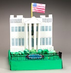
Create a replica of the U.S. White House! Learn about the building's history, architecture, and its famous occupant's ro
Track how Edison's inventions changed everyday life. Imagine a world without lightbulbs or sound recordings!
Free to play? Or busy with homework? Hang these colorful signs on your door so you can concentrate!